


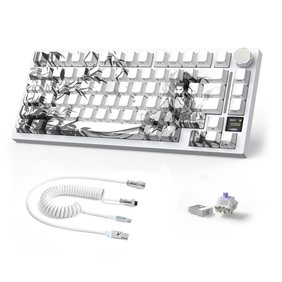
Pink usually works best as a coordinated accent on a soft, pastel, neutral, or mixed-color desk. Yellow usually works best as a brighter focal point on a neutral or high-contrast desk. The right pick for your shared desk depends on the room's existing palette, its lighting, how visible dust and smudges become, and whether you plan to swap keycaps or add a cover later. Check those four things before you commit to either color, because a pink gaming keyboard and a yellow keyboard solve different visual problems, not different performance problems.

Pink or Yellow: Choose the Desk Role First
Decide whether the keyboard should blend into the shared desk or become its main accent. That single choice narrows pink versus yellow before you look at anything else.

| Shared-desk situation | Pink path | Yellow path |
|---|---|---|
| Pastel or mixed-color desk shared for gaming and school | Coordinates with soft tones without forcing every accessory to match | Can feel too loud unless the desk already has a bold accent to balance it |
| Neutral desk that needs one visible accent | Reads as a quieter accent; may disappear on a very plain desk | Creates a clear, deliberate focal point against neutral surfaces |
| Shared room where the keyboard should not dominate | Better fit when multiple users want a calmer, less single-purpose look | Works only if the rest of the room already leans high-contrast |
When Pink Works as the Coordinated Accent
Pink fits best on pastel, soft, neutral, or mixed-color desks. In a shared bedroom, dorm, or home office, a pink gaming keyboard can feel integrated during work or school hours instead of screaming "gaming setup" the moment someone sits down. You do not need every accessory to match. A pink keyboard next to a gray desk mat or a plain monitor stand still reads as intentional, not mismatched.
When Yellow Works as the Focal Point
Yellow fits best on desks that need one clear visual anchor. If the surrounding accessories are black, gray, white, or blue, a yellow keyboard gives the setup a defined focal point rather than blending in. Use yellow on purpose, as the accent the rest of the desk supports, rather than trying to match every other item to it. Either way, color is a finish choice. It does not change gaming performance, so treat hue as a design decision and let switch type, layout, and connectivity handle the performance questions.
Test Pink and Yellow in the Lighting You Actually Use
Neither color survives every lighting condition the way a product photo suggests. Judge each candidate by how well its legends stay readable against the keycap surface, not by the hue alone.
Check Legend-to-Keycap Contrast
- Look at light-dark separation between the printed legend and the keycap color, not just the overall shade.
- Check the legend treatment together with the keycap surface under your normal backlight setting.
- Prioritize readability first if the keyboard will be used for gaming, work, and school on the same desk.
Judging text against background this way follows the same logic used for general on-screen readability: light-dark contrast between legends and keycaps matters more than color alone. That guidance supports readability in general; it does not certify either keyboard color as meeting a specific accessibility standard.
Compare Daytime and RGB Appearance
- View the keyboard in bright daytime or overhead lighting and note whether the legends stay crisp.
- Switch to dim evening lighting and check whether either candidate loses definition.
- Turn on the RGB setting you actually use most and recheck legend separation one more time.
If a candidate loses clear legend separation in any of these three conditions, reject it or change the backlight choice before you order. Do not let a matching wall color override a keyboard you cannot read in your own room.
Use the Finish and Cleaning Visibility as a Tie-Breaker
Color alone does not tell you which keyboard will look cleaner day to day. Use the actual shade, surface finish, and your lighting as the real tie-breaker instead.
Treat Visibility as a Finish Question
Dust, oil, shine, and discoloration show up differently depending on the exact shade and surface finish, not the color family. A light pink and a light yellow can both hide or reveal grime depending on the finish and how bright the room is. Do not confuse visible buildup with an actual cleaning advantage. A finish that shows dust clearly just means you will notice sooner, not that it is dirtier.
Set a Routine for a Shared Keyboard
- Power down or unplug the keyboard, then remove loose dust and crumbs with a soft brush or compressed air.
- Wipe the exterior with a lightly damp microfiber cloth, keeping liquid away from the switches and electronics.
- Add a cover or a storage spot when the keyboard moves between users, rooms, or activities.
Choose the finish whose visible buildup you can realistically monitor and clean between shared uses. That matters more than whether pink or yellow looks cleaner in a photo.
Plan Keycaps, Covers, and Wrist Rests Around the Exact Keyboard
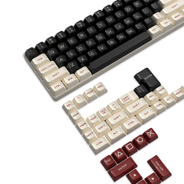
Before you shop for keycaps, a cover, or a wrist rest, verify layout, profile, stem, stabilizer, and bottom-row coverage on the specific keyboard you own. Color matching should come after that check, not before it.
A 75% ANSI Path for an OEM-Profile Setup
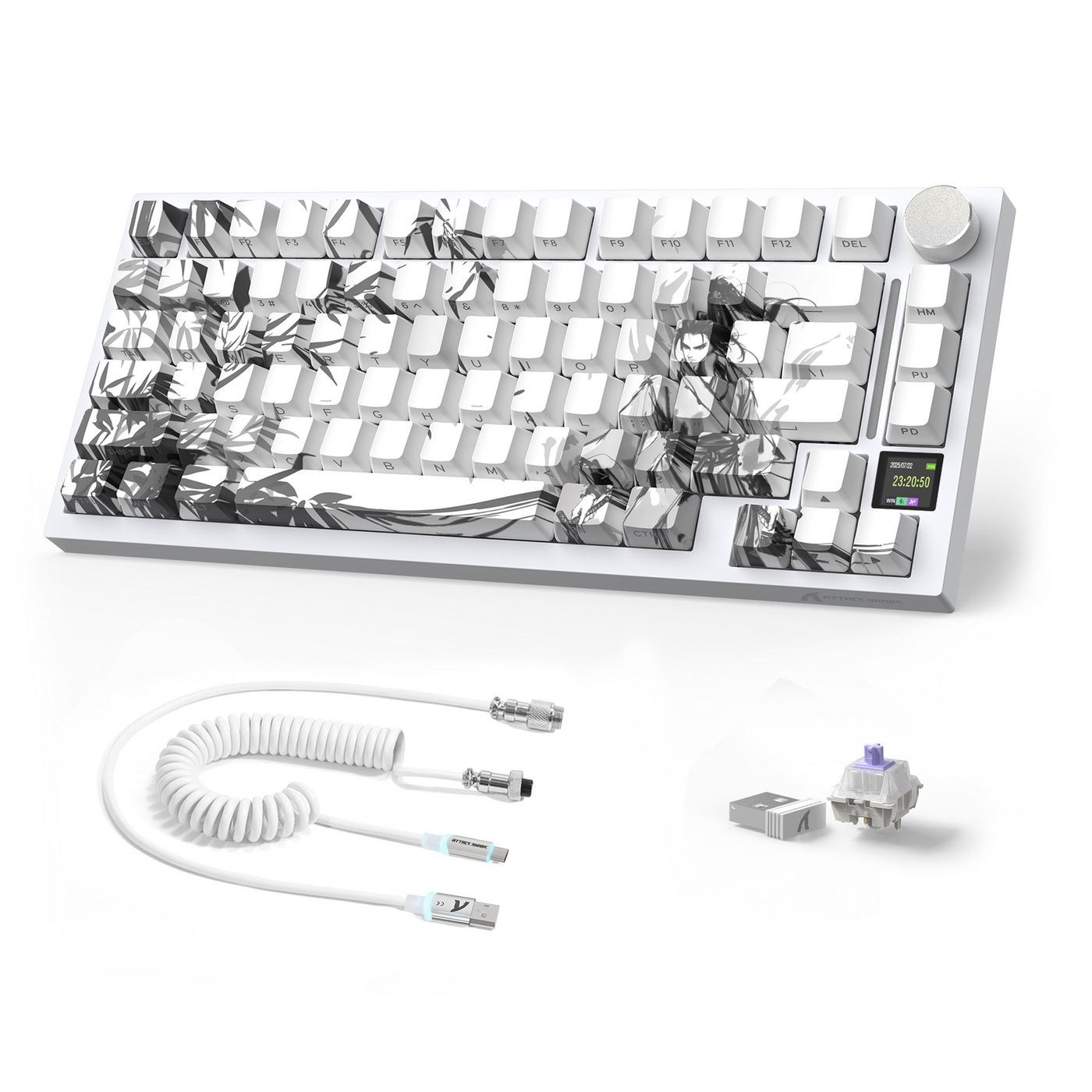
Our ATTACK SHARK X820 ULTRA Mechanical Keyboard with C01ULTRA Coiled Cable is documented as a 75% ANSI layout with 80 keys plus a knob, and it ships with OEM-profile PBT keycaps. That documented profile and layout give you a starting checklist if you are building a pink-themed setup: confirm the same 75% ANSI bottom row, OEM profile, and stem type on any replacement set before ordering. Hot-swap switch support does not by itself guarantee that a color-matched keycap set covers every key.
A Compact ANSI Path for a Smaller Setup
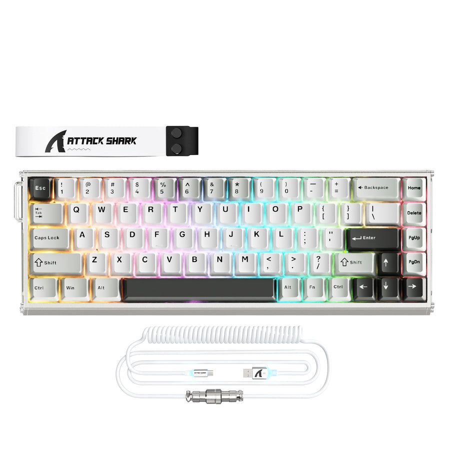
Our ATTACK SHARK X66 Wireless Mechanical Keyboard with Side Printed PBT Keycaps is documented as a 66-key compact ANSI layout with OEM and PBT double-shot keycaps. That gives you a starting point for a yellow-themed compact setup, but compact layouts often use nonstandard key sizes. Confirm stabilizer spacing and bottom-row coverage before buying a replacement set. If you add a wrist rest, check its listed dimensions against your keyboard rather than assuming a color match means a physical fit. When you are ready to compare finishes and profiles, you can browse replacement keycaps to see current OEM and PBT options side by side.
Do not order replacement keycaps, a cover, or a wrist rest until the layout coverage, profile, stem, stabilizer, and dimensions actually match your keyboard.
Make the Final Choice With One Shared-Desk Decision Sequence
The shortest reliable path is to choose the color by its visual role, test both candidates in your actual room lighting, then confirm cleaning and accessory fit. If either candidate fails the lighting or fit check, stop that purchase path and use the other verified route.
- Decide the visual role first: pick pink for a coordinated accent on a soft or mixed palette, or pick yellow for a bright focal point on a neutral or high-contrast desk.
- Test both candidates in your actual bright daytime, dim evening, and normal RGB lighting, and drop any option that loses legend-to-keycap readability.
- Use cleaning visibility and confirmed accessory fit as the final tie-breakers, choosing the finish and accessory path you can maintain and physically support.
Once the color and fit checks line up, move ahead with the keyboard or keycap path that matches your shared desk.
FAQ
Which Color Is Easier to Keep Clean?
Neither pink nor yellow has a proven cleanliness advantage. Visible dust and shine depend on the exact shade, finish, and keycap material. Inspect the actual keyboard under your normal lighting and pick the finish whose buildup you will actually notice and wipe down.
Do Pink and Yellow Gaming Keyboards Affect Gaming Performance?
No. Pink and yellow are visual finish choices, and nothing here ties hue to gaming performance. Base performance decisions on switches, layout, and connectivity, not on keyboard color.
How Do I Match Pink or Yellow With Existing Desk Accessories?
Use pink as a softer accent on pastel, neutral, or mixed accessories, or use yellow as a brighter focal point against neutral or high-contrast accessories. Check the color under your real lighting, then confirm physical fit before ordering matching keycaps or a wrist rest.
Are Pink Gaming Keyboards Suitable for Adults and Shared Workspaces?
Yes, when the color fits the room's palette and stays readable under normal lighting. The shared-desk lighting and palette test matters more than any assumption that pink is only for one type of user.